Pencil, Ink, Pen and wash.
Category: Illustration
Pot Plant Study in Oil
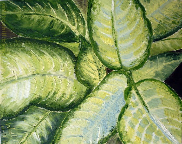
Oil Paint
Somerset Cottage Fireplace
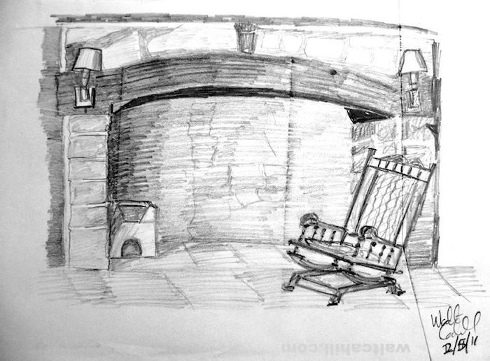
Somerset Cottage Fireplace
Somerset Cottage Garden
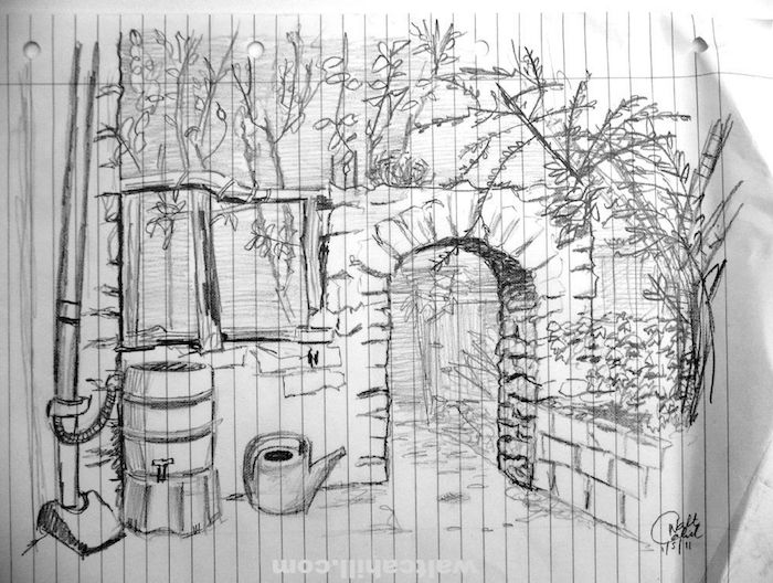
Somerset Cottage Garden. I went away for the weekend unprepared for art but luckily I found some hole punched A4 lined paper.
Portrait Study #6
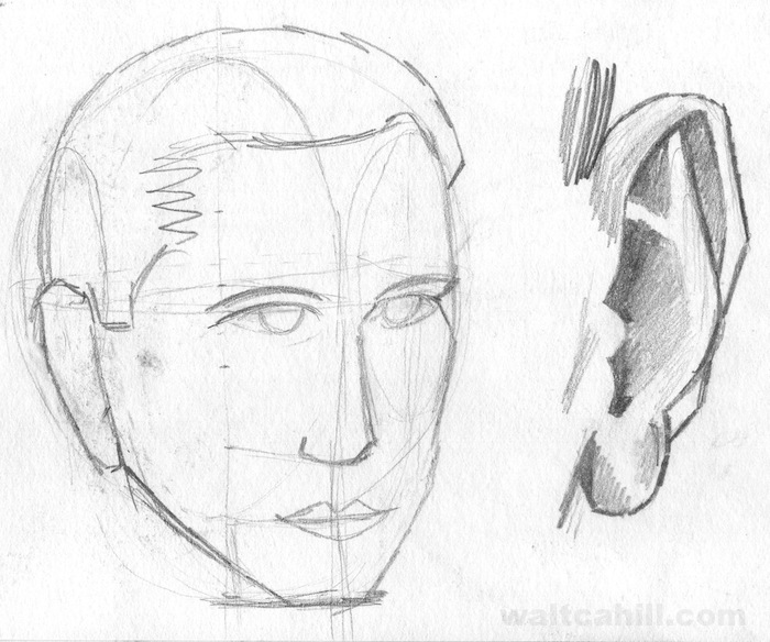
Portrait theory and observations
Marker Visual for Japanese Bureau Map Cover
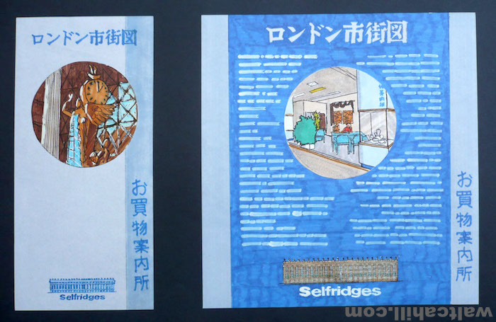
These are hand rendered marker visuals I produced to seek approval in advance of commissioning printers to supply colour proofs. This was in the days before scanning and proofing via desktop publishing became affordable, reliable and supported by adequate software and hardware.
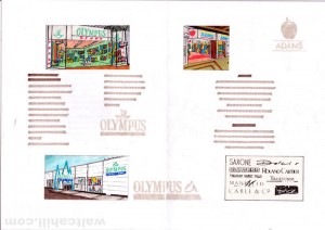
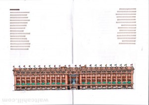
Marker Visuals for London Pager brochure
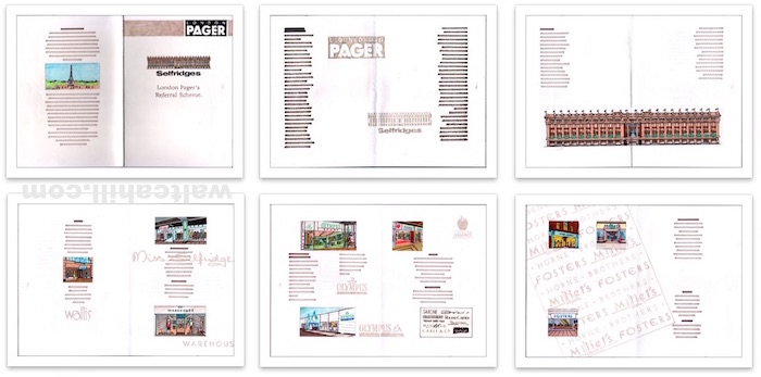
These hand rendered marker visuals I produced were approved in advance of me progressing the project to the printers for colour proofs. This was in the days before scanning and proofing via desktop publishing became affordable, reliable and supported by adequate software and hardware.
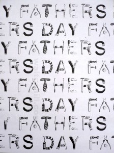
Fathers Day Logotype Illustration
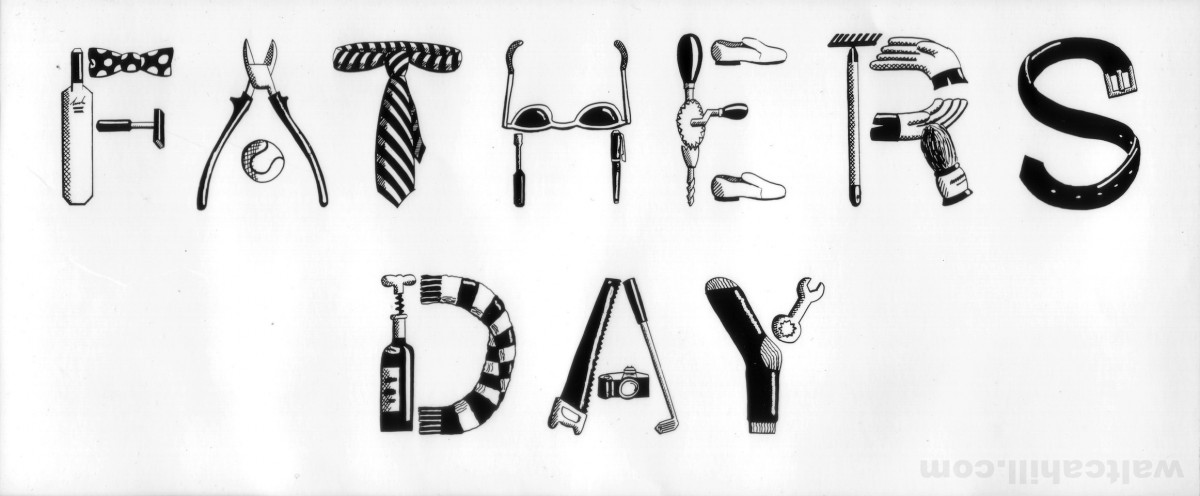
I produced this illustrated logotype using fine technical ink on CS10 board. It was a central element of some of my design proposals for a Fathers Day promotion at Selfridges back in 1992.
I had originally developed these illustrations of gifts for men from research around the store and as a background pattern for the other design solutions I submitted.
Gifts for Men Illustrations
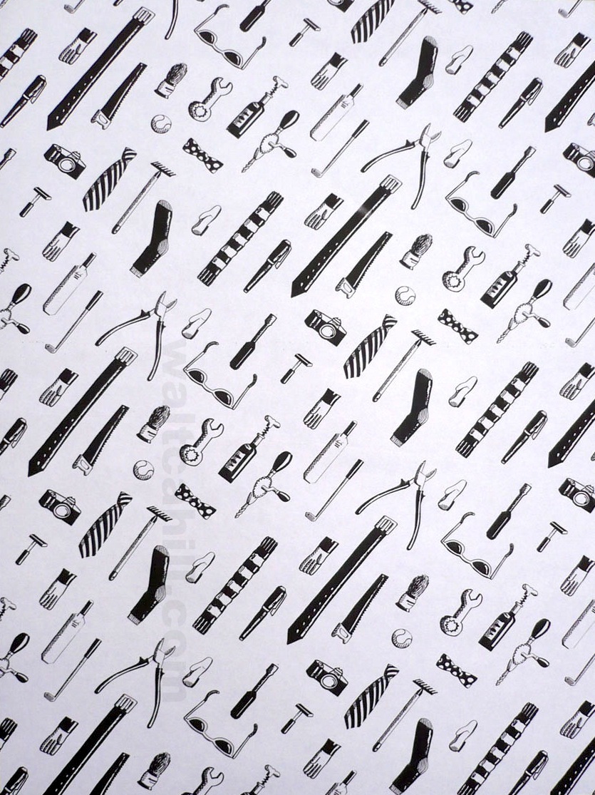
I used tech pens to develop and detail pencil illustrations from my research around the Selfridges department store where I explored typical and suggested Fathers Day gifts. Back in 1992 I incorporated them in some of my proposed designs as marker visuals for a Fathers Day promotion.
When my other typographic solution was chosen instead (which I also created from these components) I continued rendering these illustrations into a pattern to propose a wrapping paper product to form part of the promotion.
Wedding Bell and Ribbon Illustrations
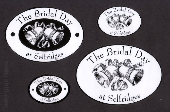
I hand drew these bell and ribbon illustrations in ink using a combination of technical ink pens and fine permanent ink markers on CS10 art board. I experimented with reversing out the art on a black background for greater impact. The Illustration was central to the logo I designed to promote the Bridal Day at Selfridges back in 1992.
Back to School. Felt Marker Ilustrations
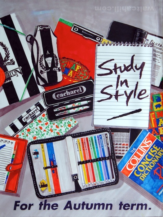
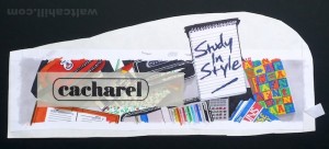
I produced these two felt marker illustrations as concepts in advance of photography based ‘back to school’ promotion called Study In Style for Selfridges back in 1992. The main purpose of these illustration was to get approval for the display solution and to provide a specification for commissioned photographers. I used magic markers on bleedproof marker paper.
Wine Club Illustration
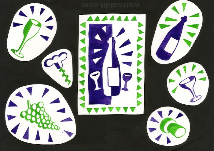
My illustrations on the subject of wine drinking provided the main graphic elements for the Selfridges Wine Club leaflet I designed, artworked and commissioned for print back in 1992.
I used gouache paint for vibrancy and to represent red and white grapes and then specified the pantone inks that best representing these colours.
Barcode (and Rolo) characters for Selfridges (1991/2)
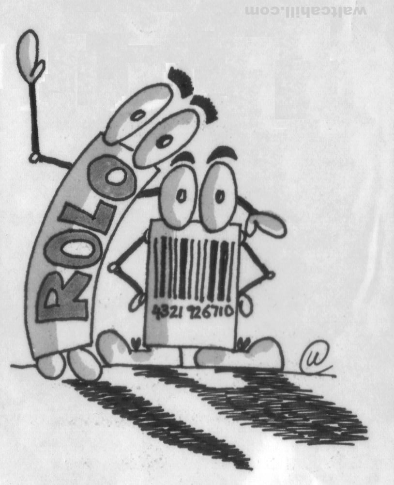
These two characters were the result of a request for a lighthearted barcode character illustration for Selfridges to illustrate a staff magazine article on the importance of Stock Keeping Unit Numbers.
Paint illustration on balsa wood
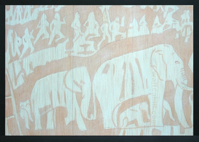
I painted the central graphic element in paint directly onto balsa wood veneer, which I had glued to mount board. The detail and the contrast between colours had to be subtle so as not to overpower the text and image components within my leaflet design for the Selfridges Nilgiri tea promotion.
Retro Fathers Day Illustration
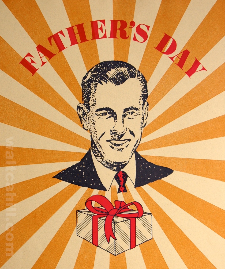
My Fathers Day illustration in a 1940s and 1950s retro style was hand drawn in ink including the typography. The rays of orange are recoloured black and white photographs of suit linen. This illustration was the core graphic element for my Selfridges Fathers Day poster designs back in 1991.
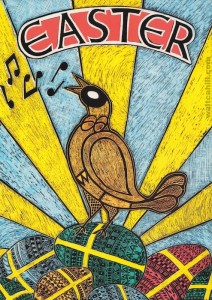
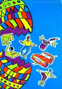
Illustrations for childrens Easter promotion. 1991
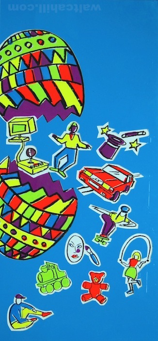
I produced these illustrations to a variety of compositions using bright gouache paint, plastic adhesive film and wax chinagraph pencil.
My aim was to move away from a traditional Easter theme for this Selfridges ‘Just For Kids’ promotion and produce something upbeat and bright to suggest fun and action packed while keeping the Easter egg as a reminder that the promotion was limited to the school holidays.
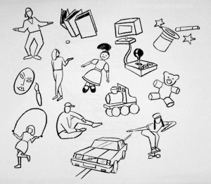
Illustrated Icons for Childrens Easter promotion
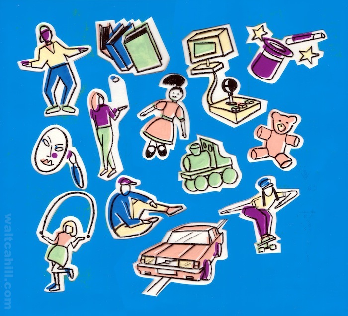
I illustrated my childrens Easter icons with painted bright gouache, plastic adhesive film and wax chinagraph pencil.
My aim for this Selfridges ‘Just For Kids’ promotion was to move away from a traditional Easter theme and produce something upbeat and bright to suggest fun and action while maintaining the Easter egg as a reminder that the promotion was limited to the school holidays.
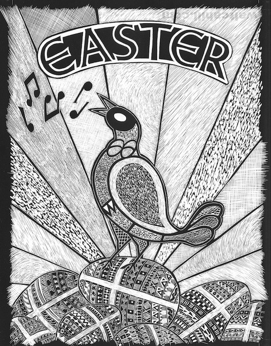
Easter Scraperboard Illustration (finished landscape)
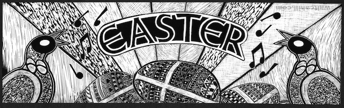
I produced this illustration using scraperboard as a central image for my Selfridges Easter Promotion designs. I developed a number of different formats with varying intensities of black to suit the lithographic and screen printing processes.
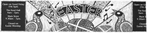
Easter Scraperboard Illustration (small format)
I produced this illustration using scraperboard as a central image for my Selfridges Easter Promotion designs. I developed a number of different formats with varying intensities of black to suit the lithographic and screen printing processes.
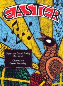
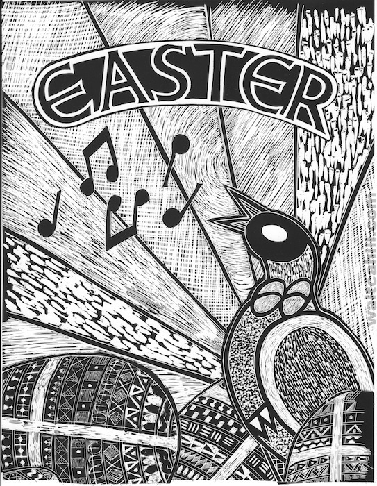
Easter Scraperboard Illustration (finished portrait)
I produced this illustration using scraperboard as a central image for my Selfridges Easter Promotion designs. I developed a number of different formats with varying intensities of black to suit the lithographic and screen printing processes.